Assignment 5 Make it up..

Assignment


img_9536
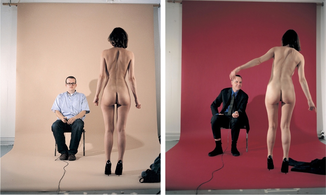
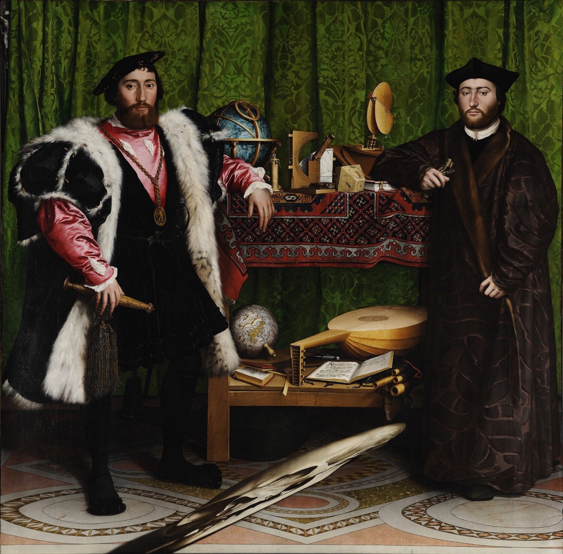
I have always been fascinated by Holbein’s painting “The Ambassadors”(1). The detail within it is spellbinding. I wanted to respond to this assignment by creating a photo inspired by this great painting. Doing this will allow me to compare photography with painting. Photography draws with light, whilst painting reflects light.

I looked at the painting in great detail considering the things within it. John Berger(2) says in Ways of seeing, “although its painted images are two-dimensional, its potential of illusion is far greater than that of sculpture, for it can suggest objects possessing colour, texture and temperature…”

Roland Barthes(3) talks about studium in Camera Lucida. He talks about the cultural things in pictures, gestures and enthusiastic commitment. Artists place things to give meaning. Then the viewer must reverse this meaning by looking and thinking. This influenced my thinking greatly in creating my picture.

Adding Punctum or a point of focus or the main thing. I wanted the clock to be the punctum. Time is invaluable and I am unsure I have the time do all I want to.

The Ambassadors reminds us of our mortality, these men have fine things and title but death sits at their feet waiting. It is a work of Vanitas, a painting that shows the transience of life, no amount of

wealth will protect you from the inevitable.

I set about making notes to help me “construct this image. I would need to be in it even though I hate being in a photograph. My work must show my interest in travel. It will be influenced by Holbein’s painting.

To see my research for this photograph please look here:

https://michaelgreencandn.wordpress.com/2018/04/27/research-for-assignment-5-2/

My research led me to Parr/Meadows(4) work in Salford, called June Street, this work shows families in their living rooms with texture and symbols. The lines in the corner give depth to the shot.

I examined Chauncey Hare (5) and his work “Protest Pictures” this must have influenced Parr and Meadows. With the same shape in the corner of the rooms shown in a lot of the pictures, the stark surroundings are very different though.

Next I looked at Susan Brights(6) “Autofocus” This work takes formal portraiture to a new level, through colour and eccentricity. The book is by a collective of photographers.

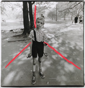
Dianne Arbus(7) captured a “Child with a hand grenade”. The light forms the stage, the child’s confident pose and gaze straight out to the viewer reminded me of “The Ambassadors.

Dita Pepes(8) work in which she plays all the female characters. fooled me into seeing each character as a different person. Not realising what I was seeing until later. Fantastic work! The colour in this work is vibrant and strong. The work uses colour textures and symbols to tell each characters story.

Jemima Stelhis(9) work “The Strip”, is different, Stripped of the lavish surroundings but with the same feel due to vibrant colour and the placement of the people. Interesting how the dressed man (the voyeur) looks at the naked woman (The object). Neither look out as they do in the Ambassadors. The voyeur not Stehli has and uses a wired remote. So control of the moment is the voyeurs. I considered showing my remote but decided it added nothing to my work.

Finally I found Maureen Paley(10), her work has stripped even the humans from her work. However she has the same feeling using colour and sumptuous shapes to give her sets the same feeling as Holbein’s painting. This work has been paired down to the minimum but is filled with colour and texture.

In my photo I wanted texture, substance and form. When I started my travels my father said “you have the whole world in your hands”. This was an important step in me taking my first adventures. So the globe must be included. The Panda represented the struggle all animals on the planet face. A bust of Shackleton who is my favourite leader. The Sharks Jaw to represent my fears of the things in the sea. The compass to point my way home. The clock shows we only have finite time to do what we want. (Whatever that is).

The Tartan is the Antarctic Tartan, the Sea Horse inspired my diving career. In Celtic art it represents a patient traveller, travelling through choppy waters, very apt.

In the Painting both subjects stance shows confidence in their beliefs. I tried to mirror their stance but not their beliefs.

20+ exposures later I finished practising the stance with the right light. I used Flash I mounted it on the camera after trying various positions. I used a diffuser with flash at 1/4 power to avoid over exposure. The camera was set at chest height, as it was in the painting. A tripod helped maintain a stable position. Remote to give me time to get into position.

My camera was set to 40mm, F2.8 100/s iso100.

Photoshop mix merged the two photos so I appear twice giving balance..

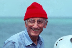
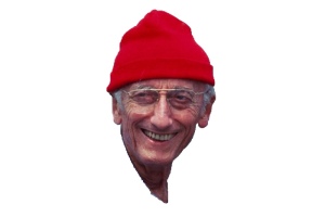
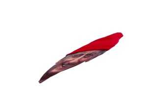
Having read, “that’smaths page” about creating an anamorphic skull. Using the described procedure I created an anamorphic Skull but substituted Jacques Cousteau who had influenced me with his work in the 1960s.

The photo shows the gap between photography and painting. Holbein could rework or change his work over a long period. Photography takes a fraction of a second and captures what is in front of the lens. Editing can only be limited to changes within the RAW algorithm. Where Holbein could take his time, add detail and change things at will. My startled look can’t be changed, Holbein could paint over it.

I enjoyed the research for this picture. Looking and thinking about the props was great fun.

This assignment has given me a greater appreciation of Holbein’s masterpiece. However the photographer is also an artist, with lots to consider but with less time to get it right.

(1)Hans Holbein. 1535. The Ambassadors. The National Gallery London.:

(2)John Berger. 1970. Ways of Seeing.. London: Penguin.

(3)Barthes, R. and Howard, R. (2006). Camera lucida. New York, NY: Hill and Wang [u.a.].

(4)Martin Parr & Daniel Meadows. 1973. Sun Street Salford. The Hyman Collection.: British Photography.

(5)Chauncey Hare. 12/10/2009. Protest Pictures. 1st ed. Steidl.

(6)Susan Bright. 2005. Auto Focus. Paris/New York: Monacelli Press 2010.

(7)Dianne Arbus. 1962. Child with a toy Hand Grenade.. New York.: National Galleries Scotland

(8)Dita Pepe. 1999 start-ongoing.. Self Portrait with men/(7)Jemima Stihl. 2000. The Strip.. Tate Gallery: Tate Gallery

(9)Jemima Stelhi. 1990-2000. The Strip. Tate Modern. 2010.

(10)Maureen Paley. 2000. Falling and Walking (phhhhhhhhhhh phossshhhhh crrhhhhzzz mn huaooogh), (detail). Art Night, London.: Contemporary Art Society.n

Contact Sheets.

,o

Research for Assignment 5.

Research

In thinking about this assignment I considered who I am? Plus what would I like to show the world. I have traveled all over the planet and dived since 1980 so both would be important for me to show in a picture.

My first thoughts took me to a painting of Poseidon sat on his throne. I thought of wearing my dry suit sat with a globe and snorkel. This would have been tongue in cheek trying to hide the fact that I love photography but hate to be photographed.

Thinking about this painting I remembered an afternoon when I was in London in the Navy. I had no interest in art. I went to the National Gallery because it was free. Hans Holbein’s(1) The Ambassadors grabbed me by my eyeballs and held me for two hours. I couldn’t leave it, the more I looked the more I saw. This would be my inspiration,

Who are the gentlemen in the painting? Why was it painted? When was it painted? What is it trying to tell us? How can can it influence my work?

img_9536

The men in the painting are Jean de Dinteville at age 29. He was French Ambassador to the royal court. To his right stands George de Selves the Bishop of Lavaur aged 25. He has been occasional ambassador to Venice and now is in London. We know there ages as Holbein tells us on the dagger and the book.

The painting shows the tools of the trades of both men. Being secular and religious so showing science questioning the status quo in religious thinking. Several clues are on plain sight such as the broken string on the lute. Showing a common symbol of discord. It is placed next to Martin Luther’s translation of the testaments a provocative book in its day.

In the center of the fore of the painting is what at first glance is a streak of grey. If you change your angle to the right and below it becomes a perfect skull. This is an anamorphic skull. Anamorphic being the perspective it is painted in. Academics can’t agree why, but it seems to work if you enter a room from the right and would have been a shock on entry. Others have argued it could have been hung on a staircase which put the viewer in the right position to see the skull. Some have hypothesised that it could just be a play on the artists surname “Holbein”, which means hollow bone.

The crucifix in the top left and the eye of the skull line up forming a triangle possibly hinting at death and rebirth. It says to me that death is waiting for all of us no matter how important we become.

We still see Anamorphic perspective today on football pitches. Adverts painted on the pitch show normally on our tv screens. On the pitch there perspective is not as it appears on the screen.

The painting was produced in 1533 the year that Henry the Eighths marriage to Catherine of Aragon is annulled. He marries Anne Boleyn in January this year. Anne has a great interest in Luther’s work. Could they have been hedging their bets whilst portraying their power?

These were turbulent times in England, power games were dangerous this painting asks questions in a way that can be interpreted differently. You could retract your message if it became challenged. It shows many of the things that made these gentleman who they are.

For my work I can show the things that have led to me doing what I do and who I have become. There are tools instruments and books that have taken me on a great journey. I can include them to mirror the textures and feel of this painting.

John Berger(2) said of this painting

“Although its painted images are two-dimensional, its potential of illusion is far greater than that of sculpture, for it can suggest objects possessing colour, texture and temperature…” John Berger 1972 Ways of seeing.

This is exactly what held my attention, the men were almost second placed to all the wonderfully painted instruments. These were in the painting to support the men and show how intelligent and powerful they were. I found them overshadowed by all this stuff.

I can’t ignore the Anamorphic skull so researched how it was painted. Concentrating on its proportions and perspective. I learnt it wasn’t just stretched but leads the eye from the correct angle to see the skull in its correct form. The skull is a vanitas, reminding that life is short, fleeting and soon over.  Not wanting to use a skull I thought about who had influenced my life. Jacques Cousteau was my earliest influence. So I experimented with a headshot to see if I could replicate Holbein’s work.

So using Adobe Photomix I cut out the head, then removed the background. Then transferred this image to an app called SKRWT. This allowed me align the head along an x and y peramater. Then I added a slight curve to make the head look like a smear from the front. Finally scaling back into Photomix. This was the last piece of the jigsaw for the finished work.

My tutor pointed me to the work by Martin Parr(3) and Daniel Meadows and their work from the 1970`s inspired by Coronation Street. They captured simple shots of people surrounded by their stuff and their place. I could see a connection with the Ambassadors. The way the people are placed, the confident way they look straight out at the viewer. a lot of them by furniture and soft furnishings. I like the photos a lot they are strangely comforting. But you can see the struggle these people endure to make ends meet. They have filled the space with textures and details just like Holbein’s characters.

in this work I noticed a common shape formed by the corner of the room. This shape adds depth to the work. Making it appealing to the eye and giving a common theme to each piece. Below I show some examples of what I mean. This shape appears in art frequently. Picasso uses it in his nudes to show female genitalia. Here it adds depth to the pictures.

This led to me looking at Susan Brights(4) Autofocus. Her book takes the formal portrait then gives it to 75 artists. This allows lots of interpretation and variation. I like the shots using brash colours they shout out from the page and emphasize Gender, Race and eccentricity. Challenging but great fun. It is a surreal sight seeing a normal situation but each shot has a twist that makes you think. Such as the project by Dita Pepes(5) work in which she plays various woman with various men. At first glance you see a natural situation. Only later do you realize what you have seen The shots do not look staged at all.

I also looked at Chauncey Hare(6) and his work “Protest Pictures”. In this work he documents homes and the residents in the USA in the sixties. He show the gap between the American Dream and reality. His work has a similar look to Daniel meadows.

In looking at Hares work I found Dianne Arbus(7) and her photograph “Child with a toy hand grenade. This photo is outside in a park. However the shot has many of the elements seen in Holbein’s painting. It asks lots of questions about the world in 1963. A boy playing in a park with a weapon of war. He gazes out from the page with the same startled look I have on my face in my photo.

My tutor pointed me to Jemima Stehli (8) and her work “The Strip”. The subject is bare and objectified. The gap between the painting and photograph has grown wider. But it still works very well. One is voyeur looking out, the other the object looks inwards.

Jemima Stehli, (Left) Jemima Stehli. Strip no. 4 Curator (Shot 11 of 12), 1999; (Right) Strip no. 6 Critic (Shot 9 of 10), 2000. Courtesy of the artist from the Strip series.

Finally I found Maureen Paley,(9)in her work Falling and Walking (phhhhhhhhhhh phossshhhhh crrhhhhzzz mn huaooogh), (detail))”.she paired the picture down to it minimum. With no people in the work. It still has plush colour with texture and intriguing patterns. It has the same sumptuous feel.

I think somewhere in these approaches is a photo I can create that will portray me to someone who doesn’t know me.

  1. Must have detail and texture with supporting props to tell the story.
  2. Must be formal so try different poses etc.
  3. Have a level of eccentricity to make the viewer linger.

Works Cited

(1)Holbein, Hans. The Ambassadors. The National Portrait Gallery., London.

(2)Berger, John. Ways of Seeing. London: Penguin, 1972.

(3)Meadows, Martin Parr and Daniel. “June Street, Salford.” Science And Media Museum. June Street. Bradford, UK, 1970s.

(4)Bright, Susan. Autofocus. London: Thames and Hudson., 2010.

(5)Pepes, Dita. “Self Portraiture with Men.” Thames and Hudson. Autofocus. London, 2010.

(6)Chauncey Hare Protest Pictures: Steidl and Steven Kasher 2009.

(7)Dianne Arbus “Child with a toy hand grenade”. https://www.metmuseum.org/toah/works-of-art/2001.474/ 1963.

(8)Jemima Stehli, (Left) Jemima Stehli. Strip no. 4 Curator 1999; (Right) Strip no. 6 Critic.

(9)Falling and Walking (phhhhhhhh phosshhhh crnhhhzzz man huaoogh. (detail) exhibition view: Art Night, London Co-commissioned by ArtNight and the Contemporary Art Society.