Research for Assignment 5.

Research

In thinking about this assignment I considered who I am? Plus what would I like to show the world. I have traveled all over the planet and dived since 1980 so both would be important for me to show in a picture.

My first thoughts took me to a painting of Poseidon sat on his throne. I thought of wearing my dry suit sat with a globe and snorkel. This would have been tongue in cheek trying to hide the fact that I love photography but hate to be photographed.

Thinking about this painting I remembered an afternoon when I was in London in the Navy. I had no interest in art. I went to the National Gallery because it was free. Hans Holbein’s(1) The Ambassadors grabbed me by my eyeballs and held me for two hours. I couldn’t leave it, the more I looked the more I saw. This would be my inspiration,

Who are the gentlemen in the painting? Why was it painted? When was it painted? What is it trying to tell us? How can can it influence my work?

img_9536

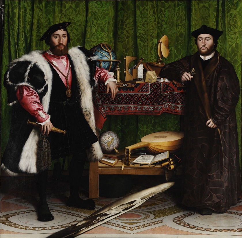
The men in the painting are Jean de Dinteville at age 29. He was French Ambassador to the royal court. To his right stands George de Selves the Bishop of Lavaur aged 25. He has been occasional ambassador to Venice and now is in London. We know there ages as Holbein tells us on the dagger and the book.

The painting shows the tools of the trades of both men. Being secular and religious so showing science questioning the status quo in religious thinking. Several clues are on plain sight such as the broken string on the lute. Showing a common symbol of discord. It is placed next to Martin Luther’s translation of the testaments a provocative book in its day.

In the center of the fore of the painting is what at first glance is a streak of grey. If you change your angle to the right and below it becomes a perfect skull. This is an anamorphic skull. Anamorphic being the perspective it is painted in. Academics can’t agree why, but it seems to work if you enter a room from the right and would have been a shock on entry. Others have argued it could have been hung on a staircase which put the viewer in the right position to see the skull. Some have hypothesised that it could just be a play on the artists surname “Holbein”, which means hollow bone.

The crucifix in the top left and the eye of the skull line up forming a triangle possibly hinting at death and rebirth. It says to me that death is waiting for all of us no matter how important we become.

We still see Anamorphic perspective today on football pitches. Adverts painted on the pitch show normally on our tv screens. On the pitch there perspective is not as it appears on the screen.

The painting was produced in 1533 the year that Henry the Eighths marriage to Catherine of Aragon is annulled. He marries Anne Boleyn in January this year. Anne has a great interest in Luther’s work. Could they have been hedging their bets whilst portraying their power?

These were turbulent times in England, power games were dangerous this painting asks questions in a way that can be interpreted differently. You could retract your message if it became challenged. It shows many of the things that made these gentleman who they are.

For my work I can show the things that have led to me doing what I do and who I have become. There are tools instruments and books that have taken me on a great journey. I can include them to mirror the textures and feel of this painting.

John Berger(2) said of this painting

“Although its painted images are two-dimensional, its potential of illusion is far greater than that of sculpture, for it can suggest objects possessing colour, texture and temperature…” John Berger 1972 Ways of seeing.

This is exactly what held my attention, the men were almost second placed to all the wonderfully painted instruments. These were in the painting to support the men and show how intelligent and powerful they were. I found them overshadowed by all this stuff.

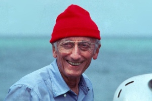
I can’t ignore the Anamorphic skull so researched how it was painted. Concentrating on its proportions and perspective. I learnt it wasn’t just stretched but leads the eye from the correct angle to see the skull in its correct form. The skull is a vanitas, reminding that life is short, fleeting and soon over.  Not wanting to use a skull I thought about who had influenced my life. Jacques Cousteau was my earliest influence. So I experimented with a headshot to see if I could replicate Holbein’s work.

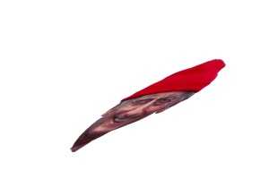
So using Adobe Photomix I cut out the head, then removed the background. Then transferred this image to an app called SKRWT. This allowed me align the head along an x and y peramater. Then I added a slight curve to make the head look like a smear from the front. Finally scaling back into Photomix. This was the last piece of the jigsaw for the finished work.

My tutor pointed me to the work by Martin Parr(3) and Daniel Meadows and their work from the 1970`s inspired by Coronation Street. They captured simple shots of people surrounded by their stuff and their place. I could see a connection with the Ambassadors. The way the people are placed, the confident way they look straight out at the viewer. a lot of them by furniture and soft furnishings. I like the photos a lot they are strangely comforting. But you can see the struggle these people endure to make ends meet. They have filled the space with textures and details just like Holbein’s characters.

in this work I noticed a common shape formed by the corner of the room. This shape adds depth to the work. Making it appealing to the eye and giving a common theme to each piece. Below I show some examples of what I mean. This shape appears in art frequently. Picasso uses it in his nudes to show female genitalia. Here it adds depth to the pictures.

This led to me looking at Susan Brights(4) Autofocus. Her book takes the formal portrait then gives it to 75 artists. This allows lots of interpretation and variation. I like the shots using brash colours they shout out from the page and emphasize Gender, Race and eccentricity. Challenging but great fun. It is a surreal sight seeing a normal situation but each shot has a twist that makes you think. Such as the project by Dita Pepes(5) work in which she plays various woman with various men. At first glance you see a natural situation. Only later do you realize what you have seen The shots do not look staged at all.

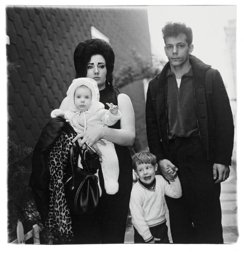
I also looked at Chauncey Hare(6) and his work “Protest Pictures”. In this work he documents homes and the residents in the USA in the sixties. He show the gap between the American Dream and reality. His work has a similar look to Daniel meadows.

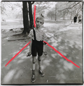
In looking at Hares work I found Dianne Arbus(7) and her photograph “Child with a toy hand grenade. This photo is outside in a park. However the shot has many of the elements seen in Holbein’s painting. It asks lots of questions about the world in 1963. A boy playing in a park with a weapon of war. He gazes out from the page with the same startled look I have on my face in my photo.

My tutor pointed me to Jemima Stehli (8) and her work “The Strip”. The subject is bare and objectified. The gap between the painting and photograph has grown wider. But it still works very well. One is voyeur looking out, the other the object looks inwards.

Jemima Stehli, (Left) Jemima Stehli. Strip no. 4 Curator (Shot 11 of 12), 1999; (Right) Strip no. 6 Critic (Shot 9 of 10), 2000. Courtesy of the artist from the Strip series.

Finally I found Maureen Paley,(9)in her work Falling and Walking (phhhhhhhhhhh phossshhhhh crrhhhhzzz mn huaooogh), (detail))”.she paired the picture down to it minimum. With no people in the work. It still has plush colour with texture and intriguing patterns. It has the same sumptuous feel.

I think somewhere in these approaches is a photo I can create that will portray me to someone who doesn’t know me.

  1. Must have detail and texture with supporting props to tell the story.
  2. Must be formal so try different poses etc.
  3. Have a level of eccentricity to make the viewer linger.

Works Cited

(1)Holbein, Hans. The Ambassadors. The National Portrait Gallery., London.

(2)Berger, John. Ways of Seeing. London: Penguin, 1972.

(3)Meadows, Martin Parr and Daniel. “June Street, Salford.” Science And Media Museum. June Street. Bradford, UK, 1970s.

(4)Bright, Susan. Autofocus. London: Thames and Hudson., 2010.

(5)Pepes, Dita. “Self Portraiture with Men.” Thames and Hudson. Autofocus. London, 2010.

(6)Chauncey Hare Protest Pictures: Steidl and Steven Kasher 2009.

(7)Dianne Arbus “Child with a toy hand grenade”. https://www.metmuseum.org/toah/works-of-art/2001.474/ 1963.

(8)Jemima Stehli, (Left) Jemima Stehli. Strip no. 4 Curator 1999; (Right) Strip no. 6 Critic.

(9)Falling and Walking (phhhhhhhh phosshhhh crnhhhzzz man huaoogh. (detail) exhibition view: Art Night, London Co-commissioned by ArtNight and the Contemporary Art Society.

Research for Assignment 4.

Assignment, Research

I wanted my chosen photograph to show what had influenced me in my formative years. I thought about my earliest memories and made a list. (1)England winning the World Cup is an early memory. I had also seen a photograph of a (2)1947 suicide victim, a lady who had jumped from the Empire State Building I had seen this in an old copy of Time magazine, it shocked me but hadn’t influenced me. I remembered (3)Earthrise, this did influence me so this was the one I chose. It had influenced other people more.


On 24th December 1968 on the Apollo 8 mission, manned by Captain Frank Borman, Command Module Pilot Jim Lovell and Lunar Module Pilot William Anders, the photo Earthrise was taken by William Anders this photo is my choice.

My research started around the picture itself, what does it show me? Then how was it taken? What was it’s affect on me and others? What was happening when it was taken across the world? Finally what had it influenced since it was taken up to the present day ?

Earthrise is a very simple photograph comprising three elements, The Earth, The Moons surface and the black void of space. Very simple, till you think that everyone that ever lived except the three photographers is in the shot. All the elements of our universe are there too in this one photograph. At the age of Seven it’s beauty took my breath away and made my imagination work overtime.

Earthrise was taken using an Hasselblad 500EL which had been modified for use with thick gloves and composition through a helmet. Large knobs had been fitted to enable the camera settings to be made easier to use. Plus the viewfinder had been changed to a ring so composition was seen from inside a helmet. I found the camera had been up for sale in the USA for $750000 in 2015. The astronauts were taking monochrome exposures of the Earthrise but luckily one of them decided to change to colour.

“Earthrise” had an immediate effect on the people on the Earth. Everyone was amazed to see it in colour. Monochrome versions had been taken from USA and CCCP missions but these were unmanned so didn’t get the feeling that Earthrise shows. The worlds media printed it over and over across the planet. I saw it in a magazine at my parents home.

Within a short period environmental organizations sprang into existence. Surely they too had been influenced by such a great photograph. Academics published books and papers to make us think about how to protect our home. Greenpeace in 1969 and Friends of the Earth in 1971.

Earlier in 1962 Rachel Carson said in (4)“Silent Spring” that human actions were threatening the planet. In 1967 Lionel Robbins received an honorary doctorate from the Heriott Watt University for his essay of 1932 in which he wrote about (5)“the earths resources being scarce”. This work is still used today. Earthrise only reinforced the planets fragility.

Looking across the world in 1968. France had student riots. Czechoslovakia was invaded by Russia. The Tet Offensive was the biggest attack of the year in Vietnam. A photo was taken in Saigon of a (4)Vietnamese policeman shooting a protester in the head that shook the world. All these events were extremely violent, so I would think that for everyone, Earthrise would be ray of light shining from the dark. It should have shaken us up but it didn’t.

Others have taken up the baton trying to make photographs that make us think of our planet.

However most people don’t get to go into space to get shots like Earthrise.

(5)Edward Burtynsky takes shots from the air of mass industrialization of the planet. They have amazing colour and composition. It’s only when you look that you realize what you are seeing.


(6)Mishka Henner shows our use of the land to pursue food and profit so destroying our environment. These are taken from Google Earth so no travel is needed minimizing the carbon footprint used to create thought provoking art.

My message in this piece of work must be that we don’t need to burn resources to make art. We can innovate what is around us to be creative. This is what our cavemen ancestors did after all.

References
(1)England win the World Cup. (1966). [Colour Photograph] London.: BBC News Website.
(2)Wiles, R. (1947). The most beautiful suicide.. [Monochrome photograph] New York.: Time Magazine.
(3)Lovell, J. (1968). Earthrise. [Colour Photograph] USA: NASA.
(4) Carson, R (1965) Silent Spring. (Book) Houghton Mifflin. USA.
(5)Robbins, L (1932) Essay on the nature and significance of economic science.(Paper).
(6)Adams, E. (1968). Man shot in head on Saigon street.. [Monochrome Photograph.] London.: Telegraph Newspaper.
(7)Burtynsky, E. (2008). Oil spill. (Colour Photograph). Online: Burtynski.com.
(8)Henner, M. (2009). Coronado Cattle Feed. [Colour Photograph.] Online.: mishkakenner.com.

Research Reflect on Diane Arbus Essay in Singular Image.

Research


diane_arbus_young_brooklyn_familyLots has been written about (1)Dianne Arbus and her images, many points of view but all agree she captures great images of certain people some feel without compassion. I want to consider my feelings about Arbus and compassion.

One type of photography in the last century has been documentary photography. This often shows disadvantaged people through either economics, mental illness or physical disadvantage. Often wealthier people have tried to show these people and there suffering to try to alleviate the conditions these people experience.

(2)Lewis Hines did this for the Farmers Union in the USA early, (3)Dorothea Lange took Immigrant Mother and it has been used ever since and is one of the most famous images around. It was taken in a Dustbowl at the height of the crash in America.

(4)Susan Sontag discusses at length middle class people looking down on people less worthy than them. She says “The most striking aspect of Arbus`s work is that she seems to have enrolled in one of art photographers most vigorous enterprises-concentrating on victims”.

Liz Jobey talks more about Dianne Arbus in Singular Images. She talks about Arbus taking pictures of “freaks” or people who are on the fringes of society, the ill, the disadvantaged or the physically scarred.

I found it interesting when she says “We pity them partly, with hindsight for their compliancy”. The way the man protects the little boy in the photograph as if having his image captured may damage his soul makes me wonder what will happen to this family. Only when reading further on that the father had been commanding the boy to stop wriggling did I think that photos can be interpreted badly from certain stand points.

Jobey takes a different point of view to Sontag when she talks about the subject not being a victim but being a great subject because they are accustomed to the thing that makes them disadvantaged.

However Arbus could and did make errors by misunderstanding signs and tells that presented themselves to her. Such as the couple being nervous interpreted as a problem in their relationship. Could it just be they are bothered by having a camera shoved at them.

We must be careful that we don’t interpret situations and show them or discuss them giving a wrong point of view to an image. We also should try to stop portraying people as victims. We should show the situations not victims.

References

(1)Arbus, D. (1966). Young Family in Brooklyn. [Photography] SAN Francisco.: MoMA.

(2)Hine, L. (1908). Boy miner Circa 1908. [Photograph Silver Gelatin] New York: NYC Metropolitan Museum.

(3)Lange, D. (1936). Migrant Mother. [Photograph Silver Gelatin] Stanford USA: Stanford University Press.

(4)Sontag, S. (2008). On photography. London: Penguin Books.


Reflections on Assignment Two Katabatic Winds.

Reflections on Context and Narrative., Reflections.

I revisited Stieglitz work “Equivalents”, which shows the effect the wind has on a cloud. You cant see the wind but you can see the shapes it makes blowing a cloud.

This made me think of Adams work, This is stoic Ice and Rock immovable, majestic. You see what it is but it isn’t doing anything. It could be a toilet or a nautilus shell it is just their.

Hurley worked hard to show the size and scale but didn’t quite get it. He showed us ice in its environment. With great tone after lugging huge cameras into rigging, what a hero.

My work hinted at all of these early pioneers. With all the elements rolled into the shots. So showing the majesty of the immovable rock and ice, with the fragility of the delicate ice crystals. All being blown around by the Katabatic winds.

The interesting thing is I hadn’t realized I had been influenced in this way by the earlier reading and studying I had completed.

salgado_0014-1024x749

My tutor mentioned Salgado and his work Genesis. His work shows the majesty of the ice with great tone. I was trying to do the same, However I had luck on my side with the Katabatibc wind appearing. I am starting to see the influence these great practitioners are having on my photography. I am seeing differently. Sometimes without realising it.

Scale, framing and disorientation were mentioned in the feedback. I took this as criticism at first. However looking and thinking about the events in front of me. Not even Hurley or Salgado could do full justice to the scale of this place and its weather. All I could do was use the equipment I had set up and try to capture some of this scary mind blowing moment. I wasn’t going to open my camera to 80-90 mph winds to change to a wider lens. I feel I got the best I could.

I didn’t have time to overthink this series it all happened so fast. Maybe this is the biggest lesson from this assignment. Go with the first thought but polish it like a diamond.

Works Cited.

(1)Stieglitz, Alfred. “Equivalent (1925).” The Phillips Collection. The Phillips Collection..

(2)Adams, Ansell. The Great Dome. Ansel Adams Gallery, Yosemite USA.

(3)Hurley, Frank. “The Blizard.” AAD. The Blizard. Sydney Australia, 1912.

(4) Salgado, and SEBASTIÃO SALGADO. “Antarctic Peninsula.” Taschen. Genesis. Sao Paulo, 2005.

Research Point Examples of relay.

Research

This research looks at different ways of telling a story with relay. I will look at the four ways used and discuss the method. Concluding with how each makes me feel.

Sophy Rickets “Objects in the field” uses a diary in conjunction with her work to portray the story. Becoming less important through time. She talks about a piece losing it’s academic value after being removed from a museum display. Dr Wilstrop talks about his photos of the sky becoming less important to the science world as they a shots of the sky 20 years before. The interview and diary show this clearly. The message is about things and people becoming obsolete.

Sophie Calle didn’t understand the meaning of a love letter, so got other women chosen not for being women but for being interpreters. Actors, Singers, Phsycologists and so on. She then portrays there interpretation and reaction to the letter. Sophie employs both still images and video to show these reactions. They are viewed at the same time. This relays the message all at once with emotions such as sadness and shock.

KayLynn Deveney in “The day to day life of Alfred Hastings uses 80 shots of Alfred along with her diary. Albert appends his own comment in the border of each photo. The three types of communication show the mundanity of Alfred’s life. They show so much that it becomes an interesting story. Alfred’s own footnotes give context to the photos and words offered by Kaylyn.

Karen Knorr, “Gentlemen”, this project uses photos of a gentlemen’s club in London. Along with quotations from Westminster speeches and the news. These show the absurdity of a system that won’t allow the Prime Minister to join her parties club just because she is a woman. So excluding her from an important source of influence and power. The combination of image and words paints a dreary picture of stuffiness that needs to changed.

When relay is used correctly it is extremely powerful. It tend to be subtle allowing the viewer to see the message for themselves. Open for interpretation but signposting the message.

References

(1)Ricketts, S. (2004). Objects in the field.. [Photograph] London: The photographers gallery.

(2)Calle, S. (2009). The love letter. [Photograph] New York: Paula Cooper Gallery

(3)Deveney, K. (2001). A day in the life of Alfred Hastings.. [Photograph] London: https://kaylynndeveney.com/the-day-to-day-life-of-albert-hastings.

(4)Knorr, K. (1981). Gentlemen. [Photography] London: http://karenknorr.com/photography/gentlemen/.

Research for Assignment 2 The Unseen.

Research

Photographing the unseen poses a number of questions. How do we see the unseen? What do we show? Are the two biggest ones in my mind. Whilst we can’t see the unseen we can see what it causes. I must show the effect of my subject for it to be truly unseen.

I am about to set off to one of the windiest places on our planet so this is my choice. But how can I show the unseen. Well wind moves things, it is the transfer of energy from one place to another. As the air moves it causes waves in water and blows small particles around.

How have others shown this, Hokusai showed the waves caused by the unseen wind in (1)”The Great Wave” in his 1829 painting of that name, I will be crossing the Drake Passage which has some amazing waves, the biggest I have seen being 11 metres tall.

Interesting to find a very similar image on the cover of (2)”Debussy’s music, La Mer it must have been influenced by Hokusai’s work.

(3)Sebastio Salgado shows ice in detail in his work “Genesis”. However his work doesn’t show anything unseen. The detail in the tone is something I want to have in my work. Because of this I think I prefer monochrome shots but will shoot in colour too to see both.

Photographing the unseen poses a number of questions. How do we see the unseen? What do we show? Are the two biggest ones in my mind. Whilst we can’t see the unseen we can see what it causes. I must show the effect of my subject for it to be truly unseen.

I am about to set off to one of the windiest places on our planet so this is my choice. But how can I show the unseen. Well wind moves things, it is the transfer of energy from one place to another. As the air moves it causes waves in water and blows small particles around.

How have others shown this, Hokusai showed the waves caused by the unseen wind in “The Great Wave” in his 1829 painting of that name, I will be crossing the Drake Passage which has some amazing waves, the biggest I have seen being 11 metres tall.

Sebastio Salgado shows ice in detail in his work “Genesis”. However his work doesn’t show anything unseen. The detail in the tone is something I want to have in my work. Because of this I think I prefer monochrome shots but will shoot in colour too to see both.

(4)Frank Hurley, captured a scientist being blown across ice on the Australian Antarctic Expedition in 1920. Whilst a great shot I will be lucky to get such an opportunity.

The beaches also have sand, snow and ice which blows in the wind, perhaps I could couple this together with Salgado’s detail to create some images.

In planning for this I will have to trust a little to chance and be ready for any opportunities that arise. Technically, light will be an issue so I must play with exposure settings on site. Also the cold will be a challenge. Batteries will have to be warmed. The biggest challenge will be the wind blowing small particles around. These particles (water, snow or ice) are not friendly to camera equipment. So I will have choose my lens prior to exposure to the elements and stick to the choice. Access to the equipment will be crucial so I will need it close by and protected. A watertight bag will achieve this.

To help me understand weather that is coming my way I bought and read Oliver Perkins excellent book “Reading the Clouds”, this will help me predict oncoming weather, so increasing my chances.

In it the book shows how to read distant clouds and predict where and when strong winds will blow. Then all I have to do is watch for particles to move.

Whilst I can’t Photograph the unseen, I can capture the effect of the unseen wind.

References

Hokusai, K. (1829). The Great Wave. [Woodblock Print.] Chicago: Art Institute Chicago.

Debussy, C. (1905). La Mer. [Orchestral Music] Paris.: A. Durand and Fils.

Salgado, S. (2010). Genesis. [Photographic Book] Berlin: Taschen.

Hurley, F. (1920). Scientist in 100mph gust.. [Photograph Silver Gelatin.] Auckland: NZGeo.

Research for Assignment One Life.

Research

Research for Assignment 1.

I have spent three months looking at and reading about photography as I felt that my knowledge for this course was a little lacking. I hope this time invested is useful going forward.

In this research I want to look at how I will tell two versions of the same story.

I looked at several practitioners and how they worked to achieve their great results.

Cartier Bresson had been looked at in my first course so seemed a good place to start.

His work was always black and white and often staged. He used geometry to create a stage and this sometimes takes over the action becoming distracting. (1)Henry Cartier Bresson said about colour photography in (2)Liz Wells book Photography a critical introduction.

“(3)Colour Photography brings with it a number of problems which are hard to resolve today, and some of which are difficult even to foresee, owing to its complexity and its relative immaturity….Personally, I am half afraid that this complex new element may tend to prejudice the achievement of life and movement which is often caught by black and white”.

I have previously done some research into why we see differently in monochrome and colour. I will consider what I learn when deciding whether to use colour in this assignment.

(4)Tomas Munita completed some work in Cuba which shows the way colour can add to a photograph. One of men stood by a road disappearing into fog resonated with me. It also echoes the use of geometry that Cartier Bresson employed. Although unstaged for the photographer it is staged in as much as it isn’t normal behaviour.

(5)Martin Parr, in the Last Resort captures normal behaviour in very strong colours. I captures order within chaos. Extraordinary in the ordinary. The scenes are totally unstaged this adds to the interest of the scenes capture. Take for example the litter. Most previous practitioners would have shied away from showing. Most these days {including me} would have used it as a message. Parr doesn’t he shows it without comment.

I recently obtained the 1968 annual from the (6)British Journal of Photography. All the photos are Monochrome. Most interesting though is the technical notes on Colour photography in the back of the book. It’s place in the notes ie before the monochrome hints at changes to come. The last paragraph of G Ashtons Progress in Colour Photography says about Ektachrome E4 film “This new process, introduced by Eastman Kodak in 1965, is symptomatic of a genera trend on the part of all colour film manufactures towards shorter and simpler processing schedules”. This would be the catalyst for the work to follow.

So my work will be in colour.

Having looked at this work I completed the following mind map.

In conclusion I want my story to use the things previously learnt. I want to show two versions of my life. It will be interesting to see if added words add to the Narrative.

References

(1)Cartier Bresson, H. (1962). en serie bilder på barnen som leker i skuggan av muren i Berlin. [Silver Gelatin Photograph] Paris: Henri Cartier Bresson.

(2)Wells, L. (2015). Photography. ed. London: Routledge, p.129 Documentary and Photojournalism in the Global Age.

(3)Cartier Bresson, H. (1962). en serie bilder på barnen som leker i skuggan av muren i Berlin. [Silver Gelatin Photograph] Paris: Henri Cartier Bresson.

(4)Munita, T. (2016). Cuba on the edge of change. [Colour Photograph] New York: The New York Times.

(5)Parr, M. (1983). The Last Resort. [Colour Photograph] London: Deli Lewis Publishing.

Wells, L. (2015). Photography. ed. London: Routledge, p.129 Documentary and Photojournalism in the Global Age.

(6)British Journal of Photography Annual 1968. (1968). [Book] Henry Greenwood & Co. Ltd, 24 Wellington Street, London.

Research Point: Sectarian A Project by Paul Seawright.

Coursework, Research


At first glance I find myself asking “What is this about”?
After watching Paul Seawright talking on You Tube https://Vimeo.com/76940827 (1) I understand this is the kind of response the artist desired. He doesn’t want me to see everything instantly as you would with journalistic work. This work is shot to draw you in, to question, to look, to see then and only then to comprehend the story, your story.

It draws you in and as you see it tells its tale very succinctly. You can put your own story to it but it brings you back to a central message. The work is often criticized for being obscure, the artist felt if he gave you everything it would be journalistic, by making us work for the meaning we have a far deeper experience.

Take “Thursday 14th December 1972”, on this day a pair of men on a motorbike gunned down another man at this junction. The introduction gives you the context but the photo provides the narrative. Showing the desolation of the place, along with the isolation the trouble caused this land and its people. Highlighted in this work is a stop road sign bright red showing danger and giving the sentiment “STOP!” I am sure many felt at the time. The cigarette advert makes me think of wasteful death. The caravan of temporary existence. The empty space the fact no one wants to live with death. This detail makes it Art, a photo of the death scene would tell the tale. However Paul Seawright’s work makes you think.

One shot that I couldn’t understand is Friday 25th of May (3). I have looked and looked and can’t get on with this photograph at all. Why a dog? However it fits with The artists aim of making the viewer work for their story. I sat and puzzled over this for ages others will get it straight away.


A piece of documentary photography I consider as art is “Reaching Out”(4) by Larry Burrows. It has the same depth. With undefined lines that take around the picture. Hidden messages as the wounded man searches for his wounded comrade. Capturing Terror, hurt, friendship and love in an instant. This elevates this photograph to art in my opinion. It’s meaning is not changed by becoming art. It still is a photo of the suffering in the fog of war but in an artful way.

Work Cited

(1)Paul Seawright. (2017). Sectarian Murder. [online] Available at: http://www.paulseawright.com/sectarian/ [Accessed 7 Aug. 2017].

(2jNationalgallery.org.uk. (2017). Hans Holbein the Younger | The Ambassadors | NG1314 | National Gallery, London. [online] Available at: http://www.nationalgallery.org.uk/paintings/hans-holbein-the-younger-the-ambassadors [Accessed 7 Aug. 2017].

(3jPaul Seawright. (2017). Sectarian Murder. [online] Available at: http://www.paulseawright.com/sectarian/ [Accessed 7 Aug. 2017].

(4jTime.com. (2017). Portrait From Hell: Larry Burrows’ ‘Reaching Out,’ 1966. [online] Available at: http://time.com/3491033/life-behind-the-picture-larry-burrows-reaching-out-vietnam-1966/ [Accessed 7 Aug. 2017].