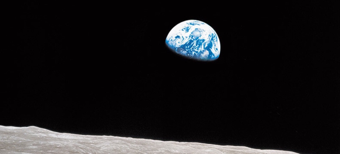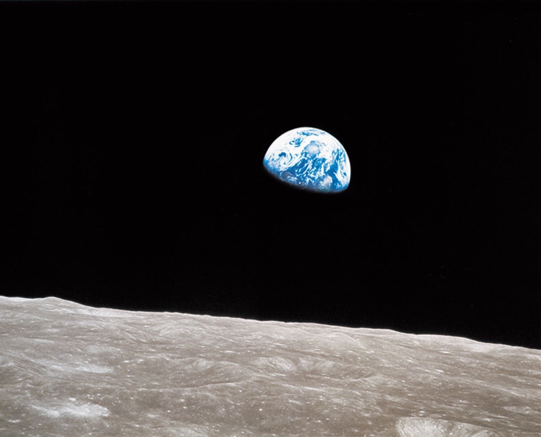
In 1968 I was shown a picture taken from Apollo 8. It comprises just three elements. The Earth, the moons grey dusty surface and an inky black frigid sky. It’s simplicity took my breath away.
When thinking about this assignment Earthrise kept coming to mind. This is the first photograph I remember. It’s simplicity has become etched onto my memory. I want to explore if we need to burn huge amounts of resource to get people to think about the damage we do to our home.
It is the first colour photograph of Earth rising over the moon taken by a human. It isn’t the first photograph taken of (1)Earthrise. Lunar Orbiter 1 had taken one in monochrome in 1966 and the Russians had taken a photo of Earthrise in Monochrome from an unmanned spacecraft earlier.
The mission was part of Apollo Project building up to a moon landing. It was the first craft to go to the Dark Side of the Moon.
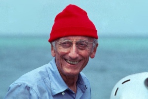
Apollo 8 was manned by Captain Frank Borman, Command Module Pilot Jim Lovell and Lunar Module Pilot William Anders. They carried cameras to record the flight. Borman was taking a monochrome shot when Anders looked out of the port and the following conversation ensued.
(2)Anders: Oh my God! Look at that picture over there! There’s the Earth coming up. Wow, is that pretty.
Borman: Hey, don’t take that, it’s not scheduled. (joking)
Anders: (laughs) You got a colour film, Jim, Hand me that roll of colour quick, would you…
Lovell: Oh man, that’s great!

Earthrise was taken using a (3)Hasselblad 500EL camera modified with larger knobs so thick gloves could operate them. A circle ring instead of a normal reflex viewfinder to allow framing through a helmet. Settings of F11 and 1/250th of a second shutter speed. The film was Ektachrome Kodak Film, in a cartridge for easy loading.
In 1968 The Tet offensive culminated a challenging year in Vietnam for the American Military. Civil rights disturbances in universities and cities around the US caused many deaths and injuries. Russia were winning the space race amidst the Cold War. France endured student uprises quashed by police violence. Czechoslovakia was invaded to prevent its exit from the Warsaw Pact. Martin Luther King and Bobby Kennedy were both assassinated.
So at the end of a year packed with turmoil Earthrise could be seen as a ray of light from the inky dark.
Earthrise was widely published around the world and triggered debate among academics and the general population in equal measure. (4)Galen Rowel called it “The most influential environmental photograph ever taken”. The environmental movement started in the next few years. Earthrise played its part by allowing humans to view home. (5)Susan Sontag discussed in On Photography, “Something we hear about, but doubt, seems proven when we are shown a photograph of it”. We had heard about our planet now we were shown it in all its glory.
However, all wasn’t triggered by Earthrise, some people were concerned about the way humans were using the Earths resources before it was taken. In 1962 (6)Rachel Carson wrote “Silent Spring” which spoke of the effects human actions were having on our planet. It details many ways we threaten the Earth. The photo reinforced her work. In 1965 (7)Barbara Ward spoke of “Spaceship Earth”, discussing the Earths resources being used and wasted and that they would soon become scarce at the rate we are using them.
Later, In 1979 (8)James Lovelock wrote “The Gaia Hypothesis” which spoke of a planet which is one big organism. With a system that keeps life in balance. Humans threaten this balance using resources too quickly.
Huge resources were used to take Earthrise. A Saturn V first stage burnt for about 3 minutes and consumed 2 Million Kilo Grams of fuel. Whilst the photo wasn’t the aim of the mission, massive resources were burnt to get this camera into a position to take a single photo..
The majority of us won’t get to venture outside Earths Gravity but others have tried to encourage thoughts and discussion about the environment through their photography.
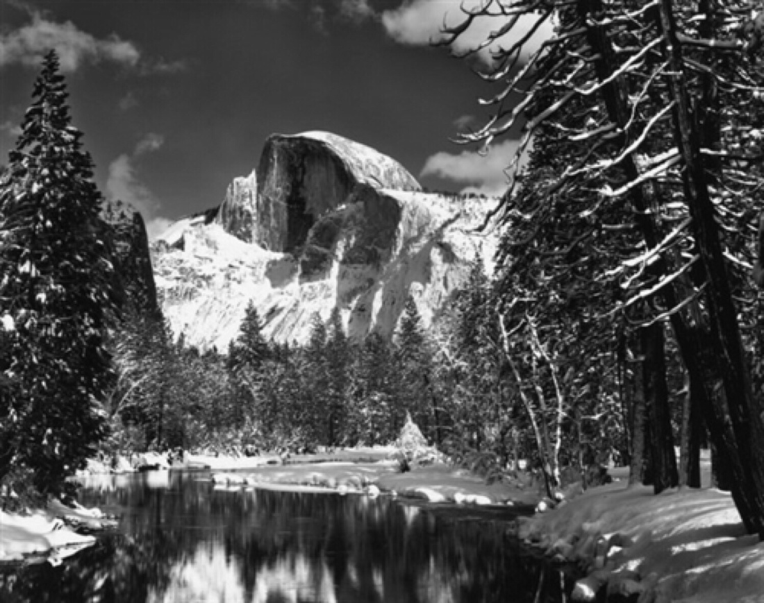
(9)Ansel Adams showed the beauty in detail in his photos of Yosemite Park in the USA. He did this, though, to show the quality of his photography not the poor use of Native Indian Land.

Edward Burtynsky(10) shows our misuse of resources in an artful way. His from within his oil work photos grab your attention, then provoke thought about our achievements.

Daniel Beltra(11) takes a different route still aerial but showing cleaning up a spill. Using chemicals. I first thought they showed beautiful shapes and colours. Then you see the clean up plane spilling chemicals to clean up the spill, revealing the irony in the frame.
Whilst this work is brilliant it has still used resources. Some practitioners are looking at using social media to get to their medium without using a camera, burning only the resources to power a personal computer or tablet.
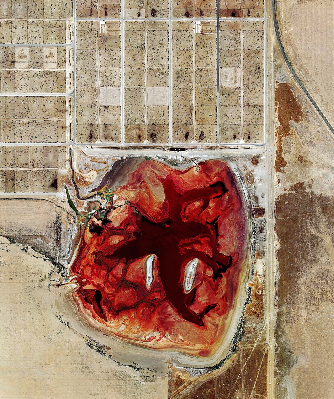
Mishka Henner(12) uses Google Earth screenshots stitched together to make full frame depictions of man’s effect on the planet. Some show sprawling cities. But the most effective I have seen are his composites of Texan feed pens. The geometry grabs my eye then I read what they are and I question everything. The ethics, use of resources and the waste of land.

David Thomas Smith(13) uses ancient Persian Rug patterns as inspiration to create patchwork’s from screen grabs from Google Earth. The patterns are pleasing and make me consider land consumption.
We don’t need to burn resources to get our points across. Technology and imagination can help us be armchair environmentalists. However using social media could increase the chances of fake news being produced. Checking content accuracy must become integral in every piece of work.
Employed effectively we can use technology to create art that is thought provoking Without burning resources. All of the above work encourages us to think of home.
The crews closing words broadcast from Apollo 8 are very appropriate.
“God bless all of you – all of you on the good Earth.”
References
(1)Anders, W. (1968). Earthrise. [Photograph] Fort Lauderdale,USA.: NASA.
(2)Apollo 8, (1968). [TV programme] NASA.
(3)Hasselblad 500EL Camera. (2016). In: Sale Catalogue, 1st ed. New York: Setadel Studios, p.60.
(4)NASA. (2017). Apollo Astronaut Shares Story of NASA’s Earthrise Photo. [online] Available at: https://www.nasa.gov/centers/johnson/home/earthrise.html [Accessed 30 Dec. 2017].
(5)Sontag, S. (n.d.). On Photography.
(6)Carson, R. (2002). Silent spring.
(7)Ward, B. (1968). Spaceship earth. New York: Columbia University Press.
(8)Lovelock, J. (1998). The Gaia Hypothesis. Films for the Humanities and Sciences.
(9)Adams, A. (1938). Half Dome, Merced River, Winter. [Silver Gelatin Photograph.] USA.: Ansel Adams Gallery.
(10)Edward Burtynsky. (2017). Home Page. [online] Available at: https://www.edwardburtynsky.com/ [Accessed 30 Dec. 2017].
(11)Danielbeltra.photoshelter.com. (2017). Daniel Beltrá. [online] Available at: https://danielbeltra.photoshelter.com/ [Accessed 30 Dec. 2017].
(12)David Thomas Smith. (2017). HOME. [online] Available at: https://www.david-thomas-smith.com/ [Accessed 30 Dec. 2017].
(13)Mishkahenner.com. (2017). Mishka Henner. [online] Available at: https://mishkahenner.com/


 ‘
‘


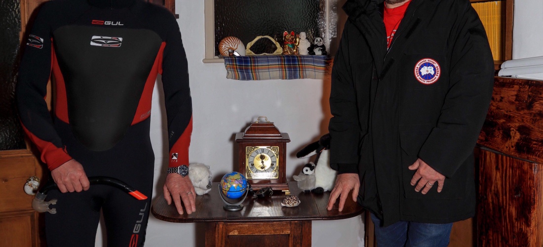
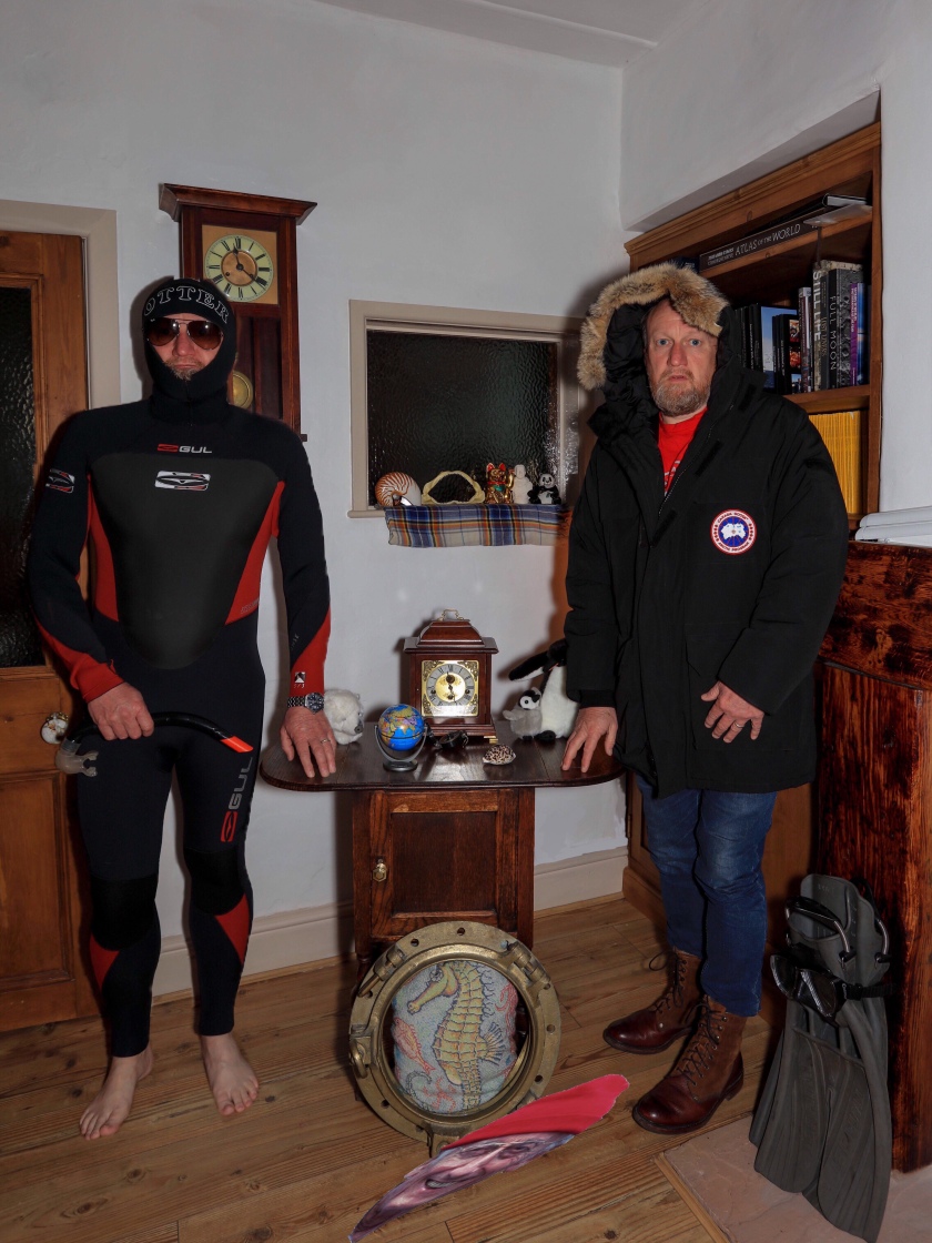
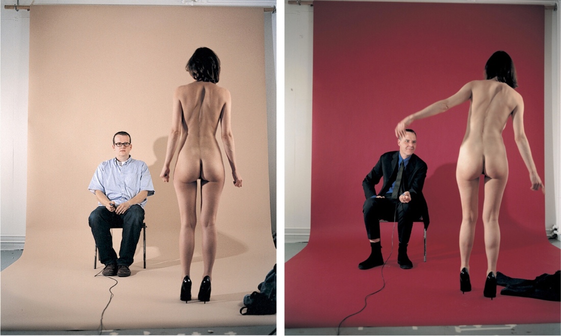
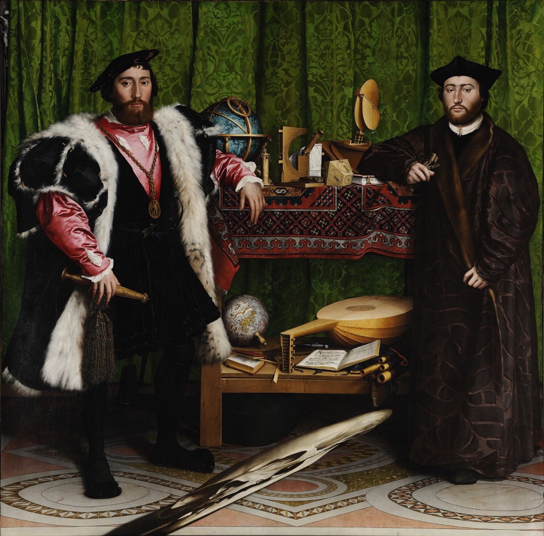 I have always been fascinated by Holbein’s painting “The Ambassadors”(1). The detail within it is spellbinding. I wanted to respond to this assignment by creating a photo inspired by this great painting. Doing this will allow me to compare photography with painting. Photography draws with light, whilst painting reflects light.
 ,
, o
o ‘
‘